
Buttons and actions
Every button in DomUI does the same thing - it calls a handler on the server - and they differ only in how loudly they ask to be pressed, and in whether they carry a value.
The components
| Component | What it is for |
|---|---|
DefaultButton |
the ordinary button: a text, an icon, a click handler. |
LinkButton |
the same, rendered as a link. |
SmallImgButton |
a small icon-only button, for inside a control or a table row. |
HoverButton |
an image button whose three states come from one image. |
CheckboxButton |
a two-sided button whose value is a Boolean. |
SwitchButton |
the same as a plain switch, without texts. |
ActionButton and IUIAction |
one description of what may be done, used by several buttons. |
ButtonBar2 |
the bar a screen's buttons sit on. |
Which one to use
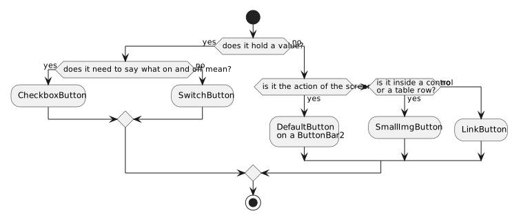
What they share
A click handler. setClicked(handler), or the handler passed to the
constructor. The handler runs on the server, in the request the click caused,
and may do anything a handler may do - change the page, open a message box,
navigate away.
Disabled, and why. All of them have setDisabled(boolean), and the ones
that implement IActionControl - DefaultButton, LinkButton and
HoverButton - also have setDisabledBecause(String), which disables the
button and makes the reason its tooltip. A disabled button sends nothing when it
is pressed.
An icon. Everywhere an icon is taken it is an IIconRef, so a font icon
(Icon.faHeart), an image (Icon.of("img/save.png")) or a themed resource
(Theme.BTN_SAVE) are interchangeable.
An accelerator. A ! in a button's text marks the next letter as the
accelerator: "S!ave" renders Save with an underlined a, and alt-A presses
it. Write \! for a real exclamation mark.
Buttons that hold a value
CheckboxButton and SwitchButton are not really buttons but controls: they
are IControl<Boolean>, they go in a form, and they can be bound. The plain
Checkbox is the third member of that
family - the same value, drawn as an ordinary tick box.